launch website

basics
bill tilley, mla
William John Tilley is the Liberal Party member for the seat of Benambra in the Victorian Legislative Assembly.
location
Wodonga, Victoria, Australia
contribution
Information Architecture, UI, UX
(for Digital Marketer Bee)
(for Digital Marketer Bee)
client
Bill Tilley is the Liberal Party member for the seat of Benambra in the Victorian Legislative Assembly. Bill advocates for fundings for small local businesses, grants to visionary entrepreneurs, strategic tourism for the elevation of heritage and natural environment, access to relief funding, healthcare, and higher education, and an increase in job opportunities for the entire district.
challenge
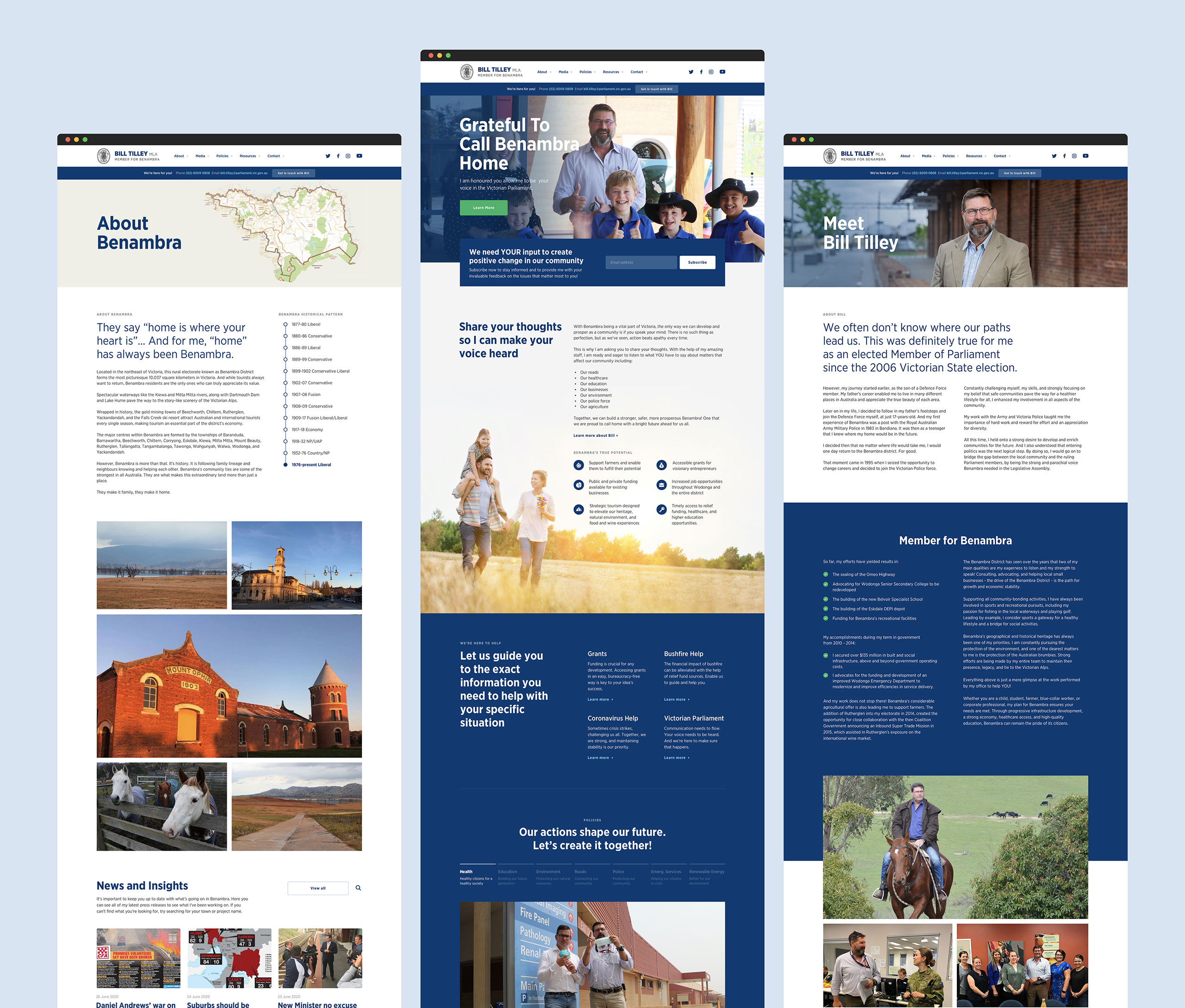
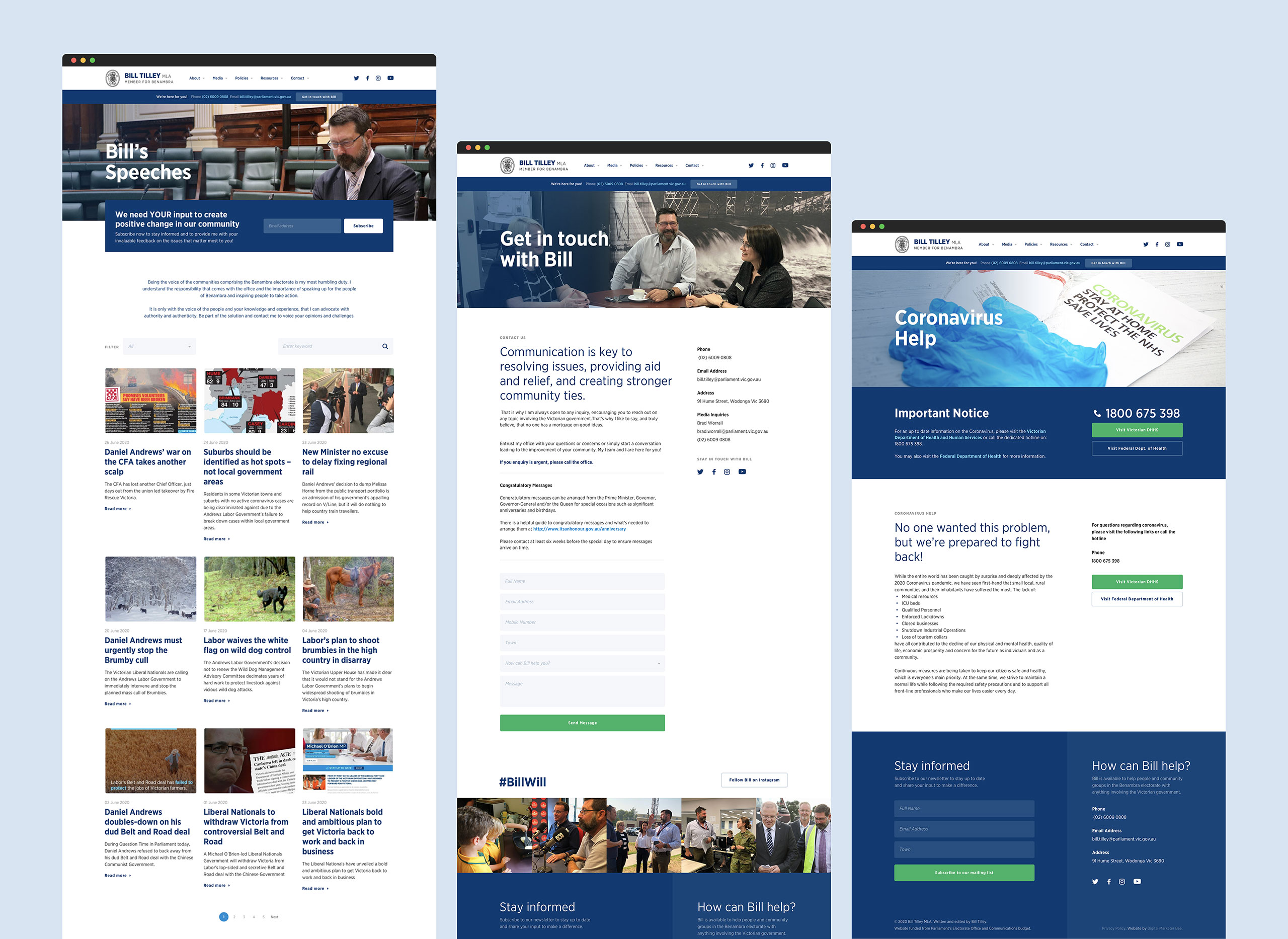
bill tilley's team asked digital marketer bee for a complete redesign and restructure of his website. The goals were to find a better way to communicate his plans, projects, and ideologies and for his website to be the support portal for his electorate.
approach and solution
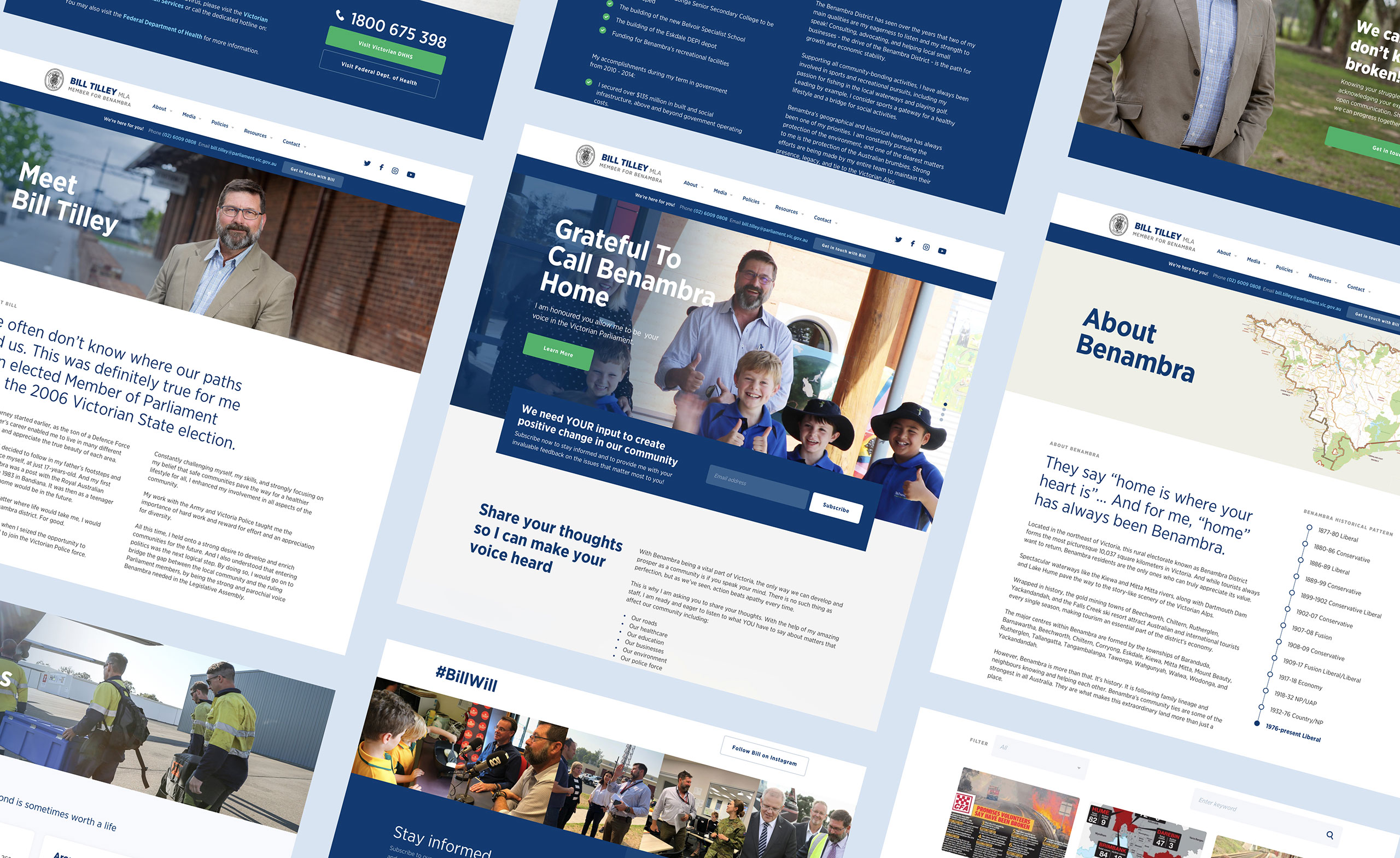
Authenticity - this was the keyword we circle back to during the whole redesign. The goal was to show the authenticity of Bill and his team to build better trust within his electorate. We’ve done this by not just solely focusing on what Bill has done but also sharing behind the scenes of his projects, the nitty-gritty of things – how Bill and his team get things done. It was important to establish a sense of trust, security, and sincerity within the website so we’ve also streamlined messaging and made it easier for users to connect with Bill.
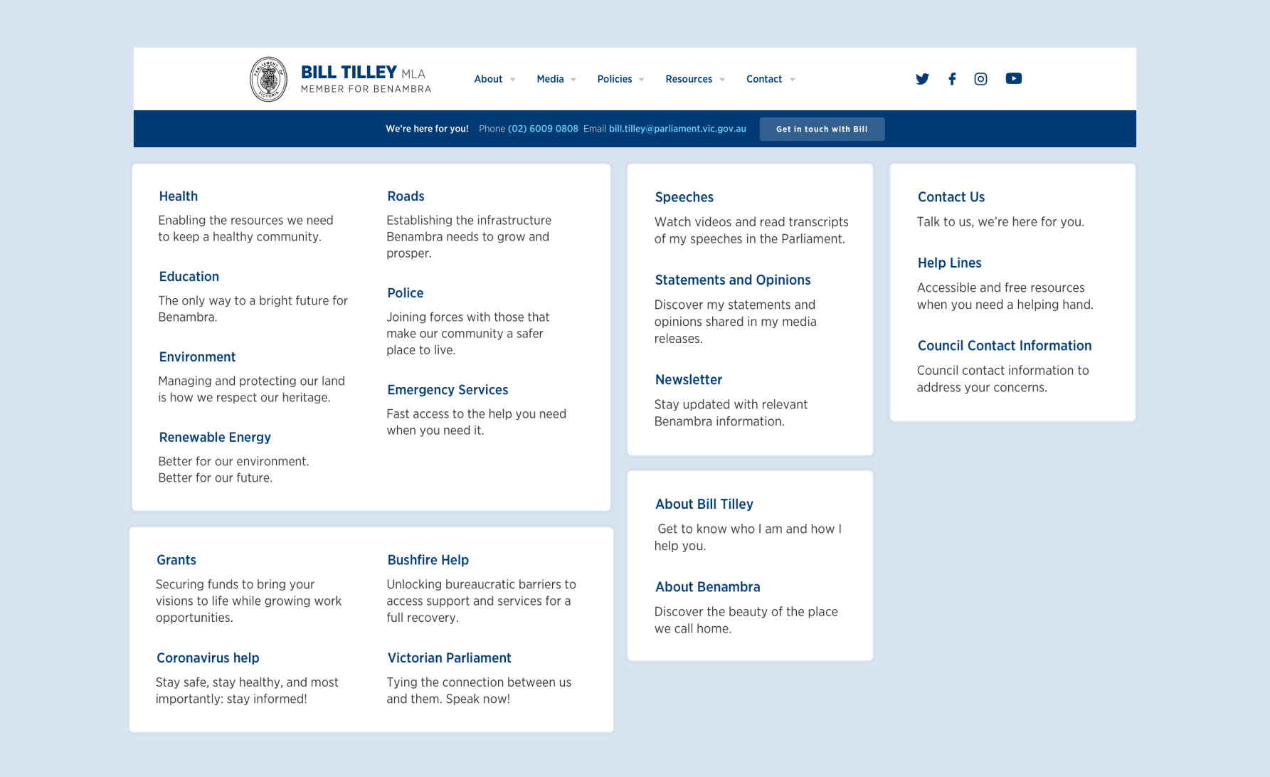
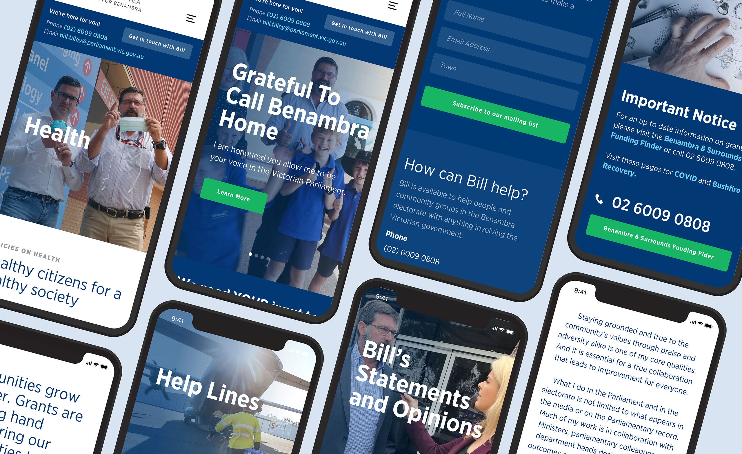
We have improved the user experience by restructuring the contents which now centre on local issues and policies, community events, and helplines. We’ve improved the navigation flow by grouping related categories and adding descriptions on each menu. Since we also wanted an easier way to connect with Bill, we've added a small but very important element on the site - the blue strip banner on top that says "We're here for you". This section has Bill’s office number and email and is always visible on all pages.
The redesigned UI is cleaner and calmer. We mostly used shades of blue as the main colour palette because it is mentally soothing and known for trust and dependability.
